KMK Ventures

Data Visualization’s Function in Financial Reporting: Converting Data into Understanding

Data Visualization in Financial Reporting

Introduction

Financial reporting now tells a story rather than merely displaying numbers in today’s fast-paced business world. However, how can we ensure that translation does not obscure this information? Data visualization is a potent tool that turns complicated financial data into understandable, valuable insights.

At KMK Ventures, we know the enormous potential of the financial data we produce to inform choices, reveal opportunities, and reduce risks. Let’s examine how financial reporting is being transformed by data visualization and why it is so revolutionary for companies like yours.

The Significance of Data Visualization in Financial Reporting

Isn’t it overwhelming to look at rows of numbers on a spreadsheet?

Now, picture those exact figures being brought to life via dynamic dashboards, eye-catching charts, and clear graphs. Suddenly, trends become evident, patterns appear, and decision-making gets quicker and better informed.

Data visualization is crucial for the following reasons:

  1. Accessibility and Clarity: Financial data can be complicated and dense. Visualization tools reduce this complexity by making information easily comprehensible to finance experts and non-experts.
  2. Improved Ability to Make Decisions: Visualizations help stakeholders make better, faster decisions by emphasizing essential metrics and trends. Visuals streamline the process, whether predicting revenue growth or finding areas for cost savings.
  3. Enhanced Involvement: Let’s be honest; conventional financial reports can be boring. Whether your audience consists of team members, executives, or investors, visual storytelling captivates them. Captivating images maintains stakeholder interest.

Read Also: Green Accounting: Sustainable Financial Reporting’s Future

Interactive Dashboards’ Power

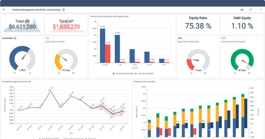
At KMK Ventures, we think giving our clients real-time insights is essential. A key component of this strategy is interactive dashboards. Clients can delve into specific details using these customizable tools, which offer a quick overview of critical financial metrics when necessary.

For instance,

  • CFO can use dynamic line charts to track changes in cash flow over time.
  • Sales managers can find high-performing areas using heatmaps to analyze revenue by region.
  • Executives can track profitability metrics by employing pie charts or bar graphs tailored to their strategic objectives.

Interactive dashboards do more than showcase data; they create a shared language among departments, breaking down organizational silos and fostering collaboration.

Reveals Insights

Perhaps the most thrilling thing about financial data visualization is that it can reveal hidden insights:

  1. Identifying Trends: Line charts and time-series analysis simplify identifying rising or falling trends in revenue, expenses, or market performance over time.
  2. Detecting Anomalies: Visualizations like scatter plots or outlier detection graphs draw attention to irregularities that may signal fraud or operational inefficiencies.
  3. Identifying Patterns: Heatmaps and bubble charts expose variable correlations that may remain masked in raw data.

For example, one organization utilized visualization tools to study fleet profitability and found they were paying too much for insurance—yielding yearly savings of $100,000. Insights such as these are priceless in terms of increasing efficiency and profitability.

Graph 1

Best Practices for Effective Financial Data Visualization

Producing compelling visualizations takes more than choosing a chart—considerable design and implementation are involved.

Below are some best practices that we adhere to at KMK Ventures:

  1. Keep It Simple: With compelling visuals, less is better. Steer clear of clutter by highlighting only the most critical data points and utilizing clean designs that prioritize clarity.
  2. Utilize Consistent Colors: Select a restricted color scheme that promotes key information without overwhelming the audience.
  3. Make It Interactive: Incorporate functionality such as filters, tooltips, and drill-downs to enable individuals to search the data based on their terms.
  4. Tell a Story: Each visualization must have an evident story behind it—what does the data tell us? Use visuals to walk your readers through the tale step by step.
  5. Avoid Misleading Charts: Take special care to avoid axis manipulation or 3D effects that stretch the actual sense of the data.

By keeping these rules, we ensure that our visualizations are visually pleasing and yield meaningful insights.

Graph 2

The Future of Financial Reporting at KMK Ventures 

With advancing technology, so goes the promise of financial reporting innovation. At KMK Ventures, we are jumping into leading-edge tools such as AI-based analytics and real-time dashboards to take the lead. By incorporating such technologies into reporting, we wish to deliver ever-increasing depths of insight and produce better business outcomes. 

Data visualization is not about making reports more beautiful—it’s about making them more intelligent. It’s about equipping our teams with the information they require to make informed decisions in a more complicated world. 

Ready to Revolutionize Your Financial Reporting? 

At KMK Ventures, we’re committed to leveraging data visualization to unlock the full potential of our financial insights. Whether you want to improve decision-making efficiency or engage stakeholders more effectively, now is the time to embrace this transformative tool. 

Let’s turn your numbers into narratives and your data into decisions! 

About the Author

Chandni LakdawalaChandni Lakdawala is a chartered accountant with an MBA in business management. With six years of experience in accounting, taxation, and auditing, she currently works at KMK Ventures, a company that provides outsourcing services to businesses in the USA.  At KMK Ventures, Chandni helps U.S.-based companies manage their financial records, ensuring accuracy and compliance with financial regulations. Her role involves overseeing accounting processes and providing insights to support business decisions.  Chandni is committed to delivering high-quality financial services and continuously seeks ways to improve processes for the benefit of her clients.

Let’s Take Our Conversation Ahead

KMK is a top outsourced accounting and tax service provider. We offer end-to-end accounting and tax services for small to mid-sized businesses, with a team of 875+ professionals, including certified public, chartered, and staff accountants.

Frequently Asked Questions

Data visualization in finance refers to the graphical representation of financial data to make complex information easier to understand. It improves financial reporting by turning raw numbers into visual formats like charts, graphs, and dashboards, helping stakeholders quickly interpret financial trends, performance, and forecasts. 

Visualizing financial data is crucial because it allows businesses to simplify complex financial reports. It enhances decision-making by highlighting key insights, trends, and potential issues, enabling quicker and more informed actions. Visualizing this data ensures clarity and helps identify patterns that might be missed in traditional spreadsheets. 

Financial data visualization lets businesses spot trends over time by visually presenting financial metrics such as revenue, expenses, and profits. This allows companies to identify growth patterns, seasonal fluctuations, and potential financial risks, essential for making proactive decisions. 

Various tools are available for data visualization in finance, including platforms like Tableau, Power BI, and Google Data Studio. These tools enable businesses to create dynamic financial dashboards, automated reports, and interactive visualizations that enhance reporting accuracy and provide real-time financial insights. 

Data visualization simplifies the importance of visualization of data by converting intricate financial data into accessible, easy-to-understand visuals. Investors and stakeholders can quickly interpret key financial indicators such as profitability, liquidity, and growth, helping them make informed decisions faster. 

The key advantages of using financial data visualization in quarterly reports include improved clarity, easier identification of financial patterns, and better performance communication with stakeholders. It helps convey the company's financial health and growth trajectory, leading to better engagement and decision-making.